How I logged and analyzed my running data to track progress in 2024
Recently, my personal "Fitness Department" reached out to my "Data and AI Department" with a request: analyze my running performance for the year of 2024. While this "department"-level communication is imaginary, the challenge was very real, and I decided to prioritize this project at the start of 2025.
Reflecting on it, taking up running was undoubtedly one of the highlights of my 2024. My initial motivation was to maximize my VO2 max, and while my Apple Watch provides an estimate of this metric, its calculation process remains a black box to me. Through some research, I learned that VO2 max generally improves when you can either run at a lower heart rate for the same pace or sustain a higher pace at the same heart rate over a given distance. Apple's Fitness app does offer pace and heart rate data per kilometer for each run, but I wanted a more holistic view. To analyze trends across three dimensions: pace, heart rate and mileage. I needed a far more flexible approach than what the app could provide.

Architecture of the project #
If you’ve read my previous blog posts on why and how everyone should set up their own databases and dashboards, you’ll find the architecture of this project just as straightforward. It revolves around two components: storing my running data in my own database and analyzing it using my own dashboards.
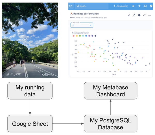
Logging the data #
While I’m still working on a fully automated pipeline to transfer data from Apple’s Fitness app to my database, I’ve been manually logging my running data in a Google Sheet for now. This sheet includes four columns: date, pace, heart rate, and distance (in km). A semi-automated pipeline triggers a workflow scheduler to load the data from Google Sheets into my database.
This setup not only allows me to analyze my data more flexibly but also ensures permanent storage of my data on my own machine, which has two main advantages:
- Data longevity: While it might seem unlikely, apps from tech companies have been shut down in the past, leaving users at risk of losing their data. If Apple ever decides to discontinue the Fitness app, my data will still be safe.
- Future possibilities: Storing my running data now opens the door to combining it with other datasets in the future. This will allow me to explore correlations and even conduct causal analyses across various aspects of my personal data.
Analyzing the data #
Here’s the visualization I envisioned before starting this project: a scatterplot of my heart rate versus pace for a specific kilometer, with points colored by the month. The y-axis represents heart rate (lower is better), and the x-axis represents pace in minutes per kilometer (also lower is better). My ultimate goal is to shift the trend line between heart rate and pace toward the bottom-left corner of the chart. This makes it easy to track my progress over time.
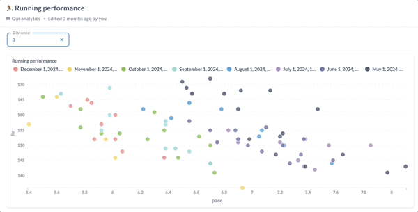
The results? I’ve been improving steadily, with the most significant progress occurring in September. For a certain kilometer, I could sustain a much higher pace at the same heart rate or a much lower heart rate at the same pace. I noticed another potential leap in November, but due to moving houses and my parents' visit, I couldn’t maintain my running routine. By the time I resumed in December, my performance had slightly regressed.